Data visualization with ggplot2
Cecilia Noecker & Data Carpentry contributors
Learning Objectives
- Produce scatter plots, boxplots, and time series plots using ggplot.
- Set universal plot settings.
- Describe what faceting is and apply faceting in ggplot.
- Modify the aesthetics of an existing ggplot plot (including axis labels and color).
- Build complex and customized plots from data in a data frame.
We start by loading the required packages. ggplot2 is included in the tidyverse package.
If not still in the workspace, load the data from the previous lesson. To start, we’ll make a plot of class-level abundances across time and across treatment groups.
We’ll first need to make a table of the total relative abundances of all features assigned to each class.
class_abund <- features %>% group_by(SampleID, MouseID, Treatment, Time_days, Class) %>%
  summarize(RelAbund = sum(RelAbund))
Plotting with ggplot2
ggplot2 is a plotting package that makes it simple to create complex plots from data in a data frame. It provides a more programmatic interface for specifying what variables to plot, how they are displayed, and general visual properties. Therefore, we only need minimal changes if the underlying data change or if we decide to change from a bar plot to a scatter plot. This helps in creating publication quality plots with minimal amounts of adjustments and tweaking.
ggplot2 functions like data in the ‘long’ format, i.e., a column for every dimension, and a row for every observation. Well-structured data will save you lots of time when making figures with ggplot2
ggplot graphics are built step by step by adding new elements. Adding layers in this fashion allows for extensive flexibility and customization of plots.
“gg” stands for Grammar of Graphics. This refers to the general concept of building a visualization by encoding meanings into different visual elements (words), and applying those to a dataset to build a ‘sentence’.
To build a ggplot, we will use the following basic template that can be used for different types of plots:
ggplot(data = <DATA>, mapping = aes(<MAPPINGS>)) + <GEOM_FUNCTION>()- use the
ggplot()function and bind the plot to a specific data frame using thedataargument
- define a mapping (using the aesthetic (
aes) function), by selecting the variables to be plotted and specifying how to present them in the graph, e.g. as x/y positions or characteristics such as size, shape, color, etc.
add ‘geoms’ – graphical representations of the data in the plot (points, lines, bars).
ggplot2offers many different geoms; we will use some common ones today, including:geom_point()for scatter plots, dot plots, etc.geom_line()for trend lines, time series, etc.
geom_histogram()for making histograms.
To add a geom to the plot use the + operator. Because we have two continuous variables, let’s use geom_point() first:

The + in the ggplot2 package is particularly useful because it allows you to modify existing ggplot objects. This means you can easily set up plot templates and conveniently explore different types of plots, so the above plot can also be generated with code like this:
# Assign plot to a variable
class_plot <- ggplot(data = class_abund, mapping = aes(x = Time_days, y = RelAbund))
# Draw the plot
class_plot +
    geom_point()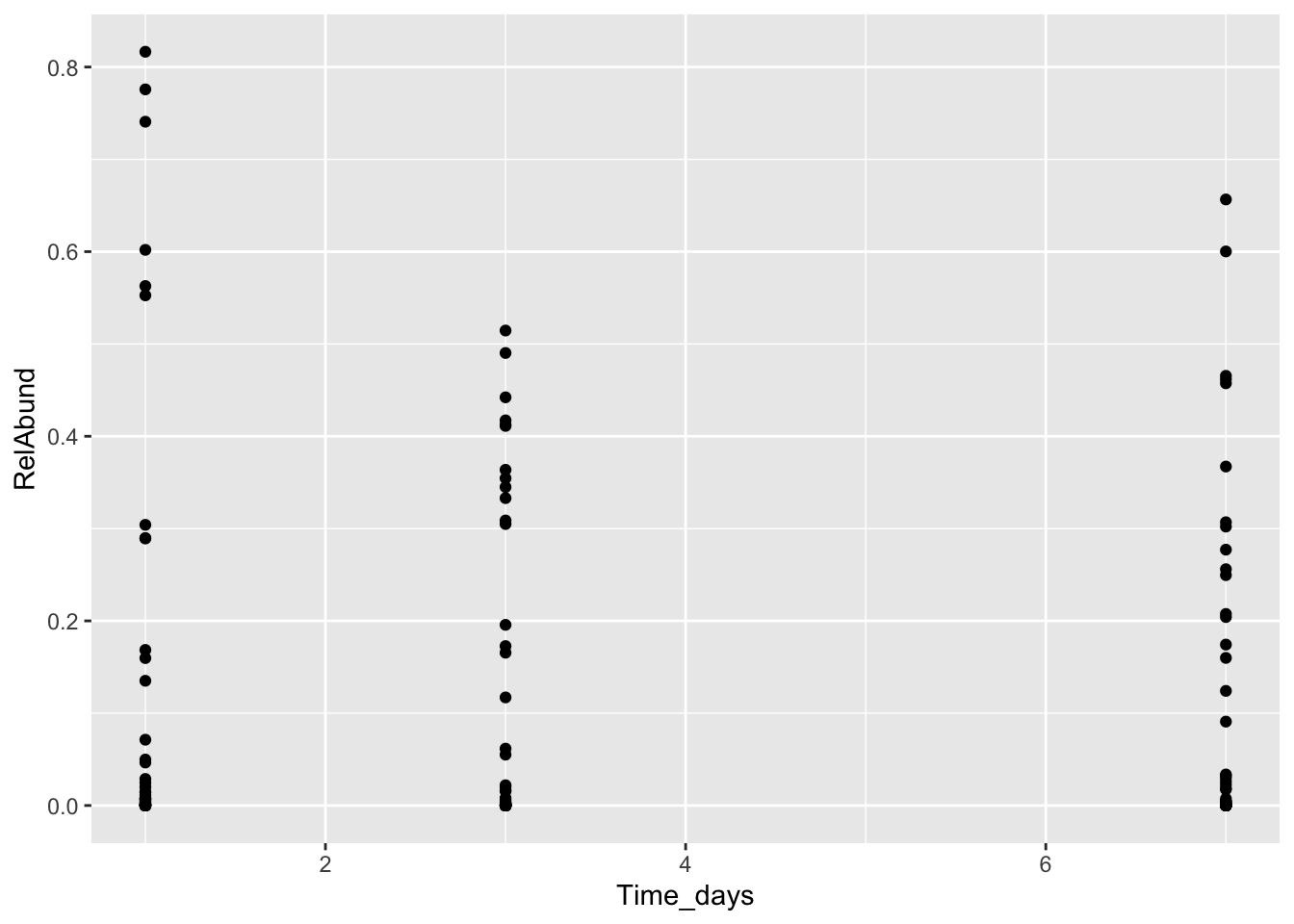
What does this mean? We still aren’t showing which points belong to which taxonomic classes. Let’s try adding lines to connect points from the same class, and coloring them by the class name.
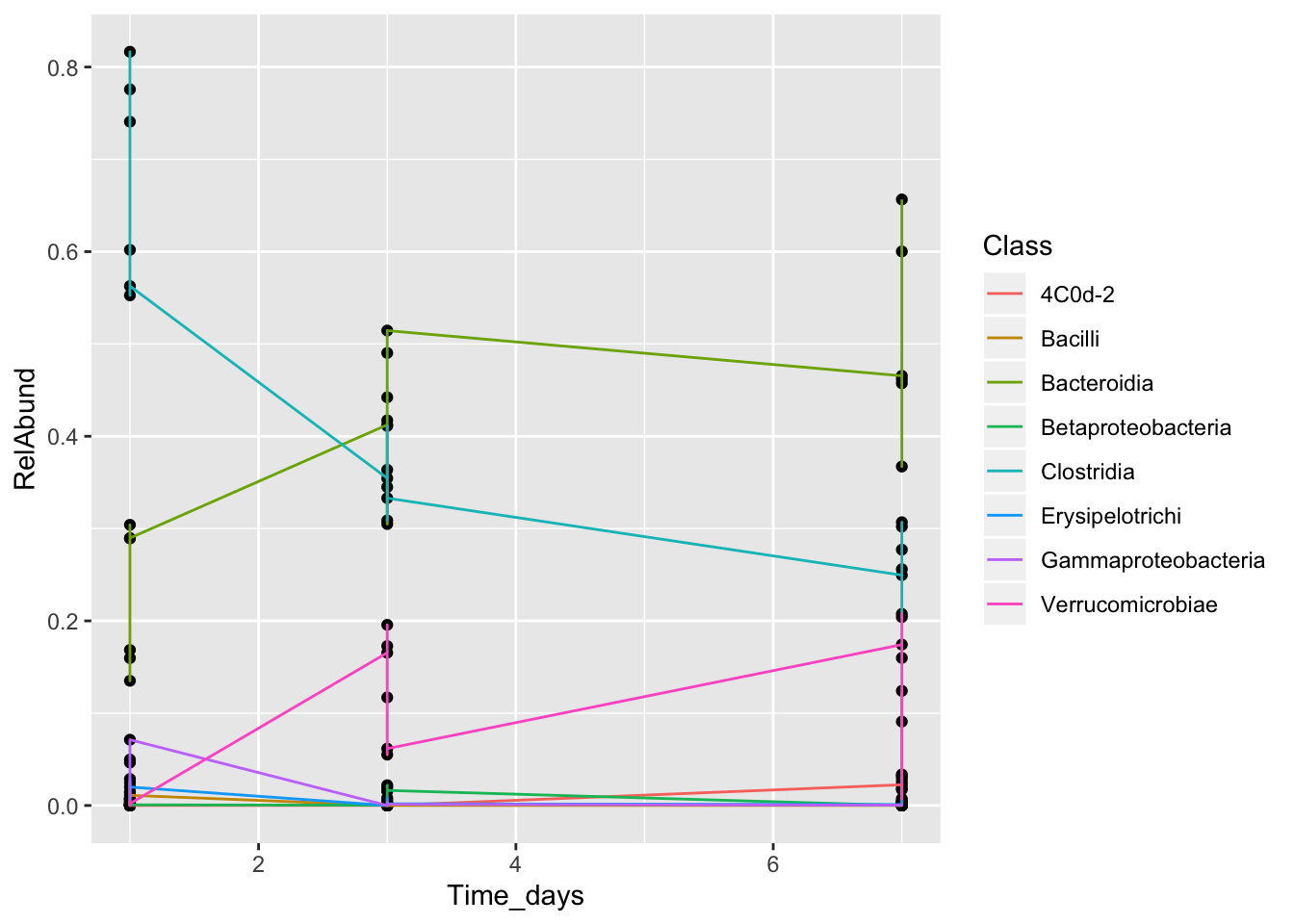
This is still not a helpful plot! The lines are connecting all the points from the same class, even if they are from different mice. We need to separate by MouseID. To do so, we can use a tool called faceting. Faceting that allows the user to split one plot into multiple plots based on a factor included in the dataset.
There are two types of facet functions:
facet_wrap()arranges a one-dimensional sequence of panels to allow them to cleanly fit on one page.facet_grid()allows you to form a matrix of rows and columns of panels.
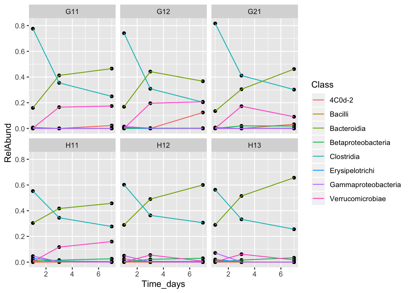
Let’s change the axis labels, and add the treatment group to our facet labeling.
class_plot <- class_plot +
    geom_point() + geom_line(aes(color = Class)) +
  facet_wrap(~MouseID+Treatment) + xlab("Time (days)") +
  ylab("Relative abundance")

class_plot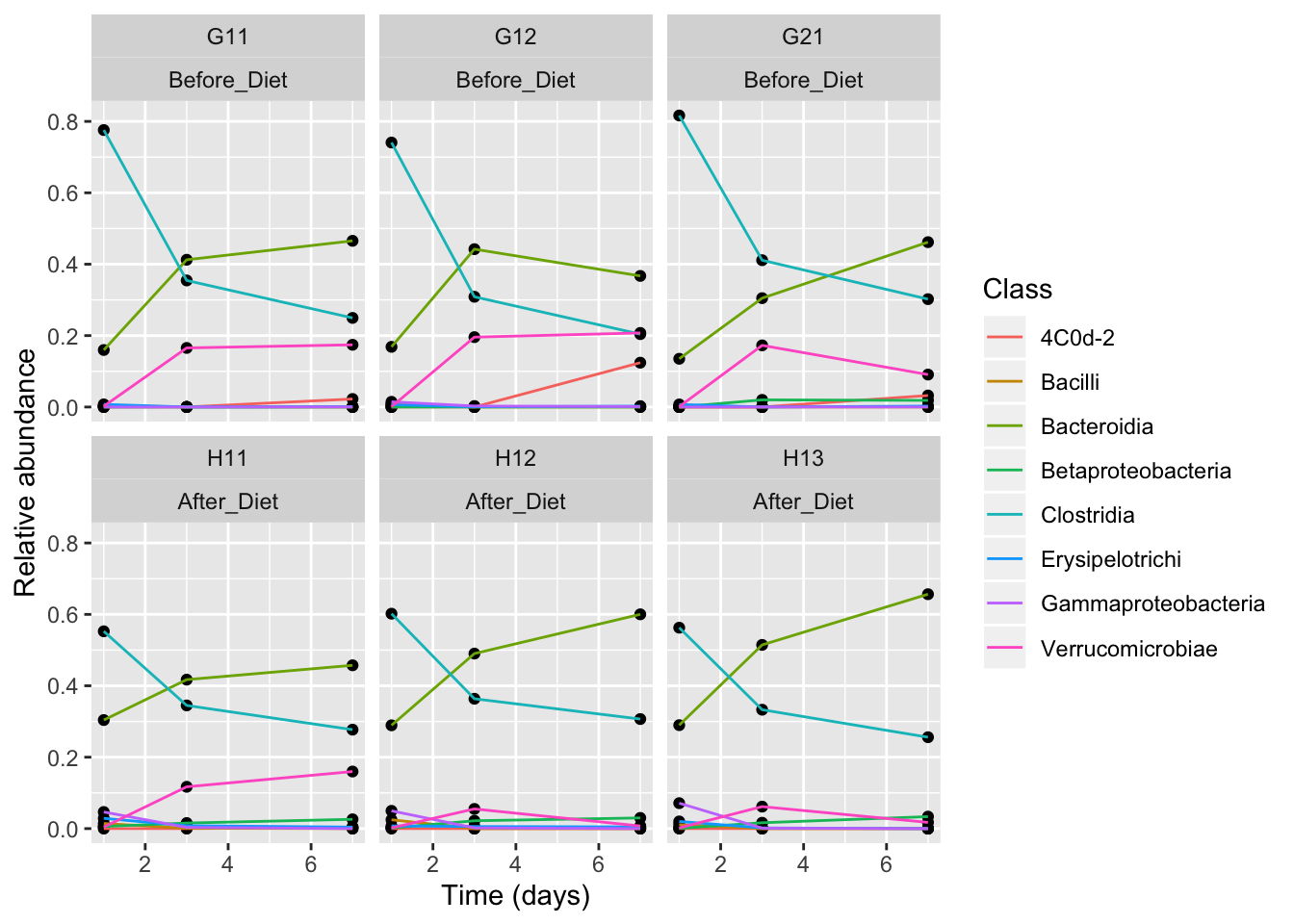
Notes
- Anything you put in the
ggplot()function can be seen by any geom layers that you add (i.e., these are universal plot settings). This includes the x- and y-axis mapping you set up inaes(). - You can also specify mappings for a given geom independently of the mappings defined globally in the
ggplot()function. - The
+sign used to add new layers must be placed at the end of the line containing the previous layer. If, instead, the+sign is added at the beginning of the line containing the new layer,ggplot2will not add the new layer and will return an error message.
More exploratory summary plots
Let’s do some more exploratory data analysis with different kinds of plots, to better understand the properties of this dataset. ggplot2 has many different geoms, but there are just a few that I use over and over for microbiome data:
- geom_point()
- geom_line()
- geom_histogram()/geom_density()
- geom_boxplot()
- geom_bar()
- geom_tile()
See https://ggplot2.tidyverse.org/reference/#section-layer-geoms for more.
Histogram of read counts
features %>%
  group_by(SampleID) %>%
  summarize(totReads = sum(Reads)) %>%
  ggplot(aes(x = totReads)) + geom_histogram()
#> `stat_bin()` using `bins = 30`. Pick better value with `binwidth`.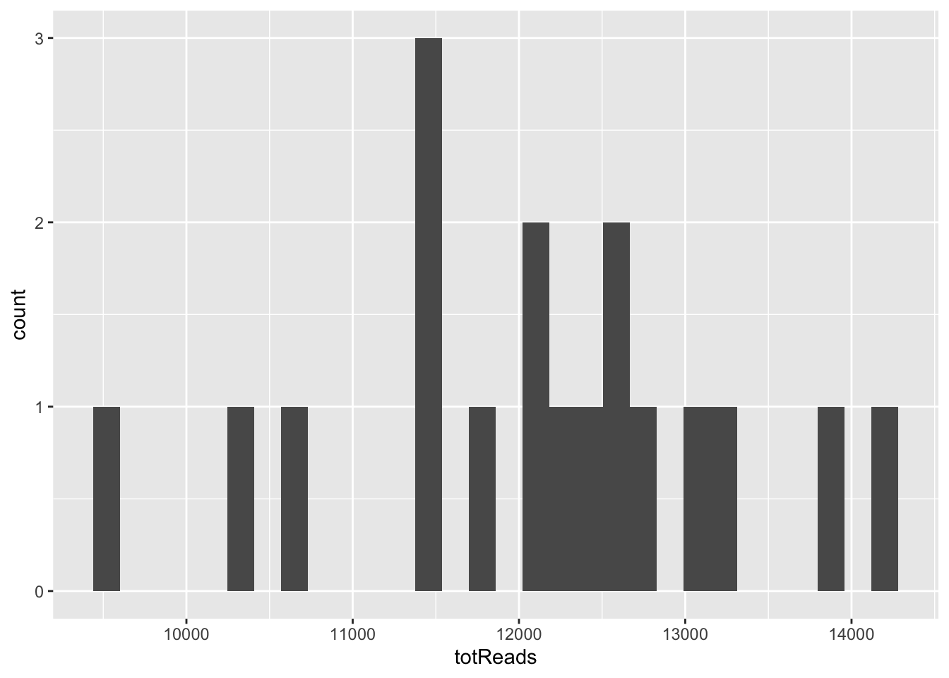
Notice the warning - 30 bins may not be ideal when we only have 18 samples! Let’s try a smaller number.
features %>%
  group_by(SampleID) %>%
  summarize(totReads = sum(Reads)) %>%
  ggplot(aes(x = totReads)) + geom_histogram(binwidth = 1000)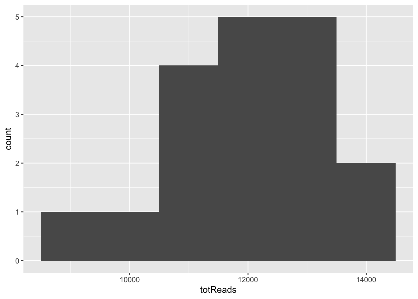
Distribution of feature abundances in each treatment group
features %>% ggplot(aes(x = RelAbund, color = Treatment)) + geom_density()
features %>% ggplot(aes(x = RelAbund, color = MouseID)) + geom_density()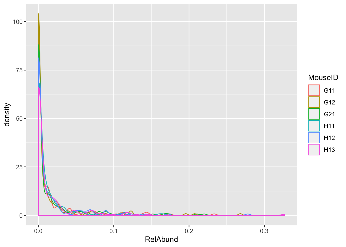
How does the number of features (alpha diversity) in each mouse change over time?
features %>% filter(Reads > 0) %>%
  group_by(MouseID, Treatment, Time_days) %>%
  summarize(NumFeatures = length(unique(FeatureID))) %>%
  ggplot(aes(x = Time_days, y = NumFeatures, color = MouseID)) + geom_point() + geom_line()

features %>% filter(Reads > 0) %>%
  group_by(MouseID, Treatment, Time_days) %>%
  summarize(NumFeatures = length(unique(FeatureID))) %>%
  ggplot(aes(x = Time_days, y = NumFeatures, color = MouseID)) + geom_point() + geom_line() + facet_wrap(~Treatment)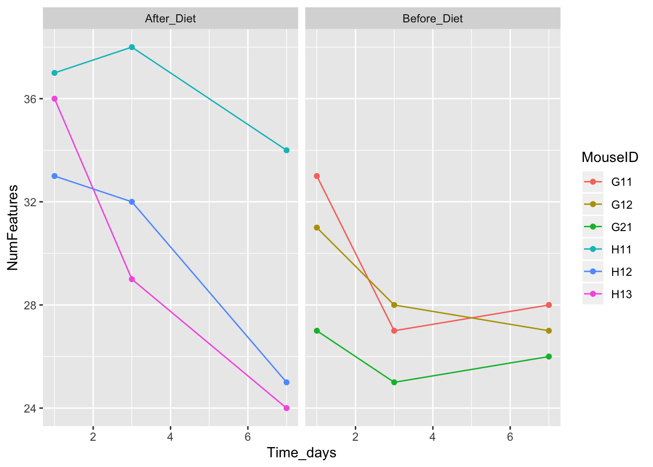
Customizing plot appearances
OK, let’s take the plot above and clean it up. ggplot2 provides infinite options to customize plot details.
features_over_time <- features %>% filter(Reads > 0) %>%
  group_by(MouseID, Treatment, Time_days) %>%
  summarize(NumFeatures = length(unique(FeatureID))) %>%
  ggplot(aes(x = Time_days, y = NumFeatures, color = MouseID)) + geom_point() + geom_line() + facet_wrap(~Treatment)

features_over_time + theme_bw()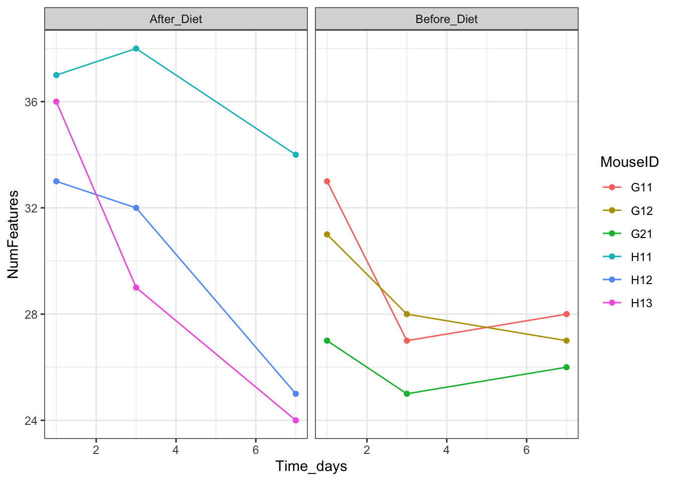
I like to use a theme from the package cowplot:
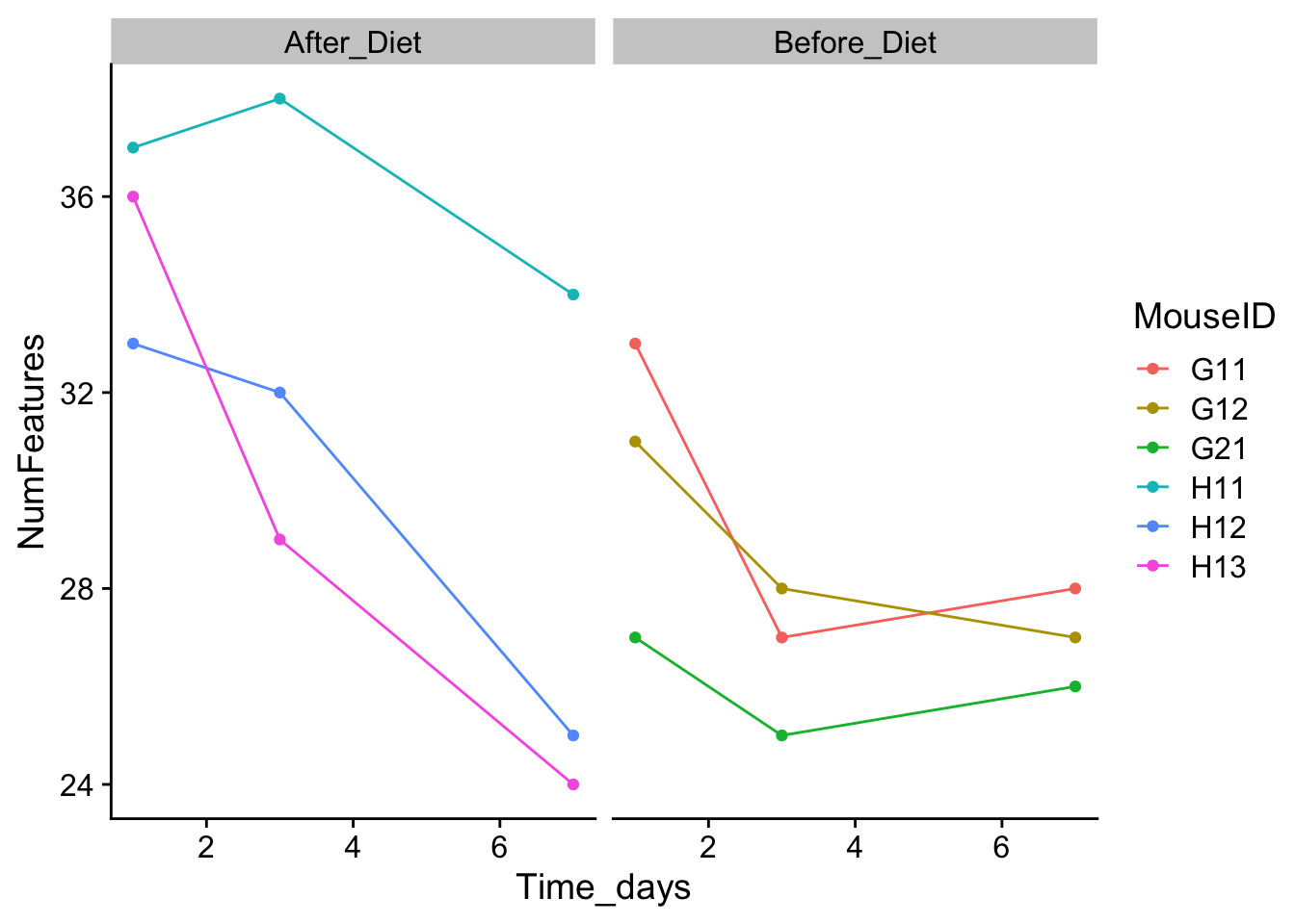
You can also modify individual elements of a theme:
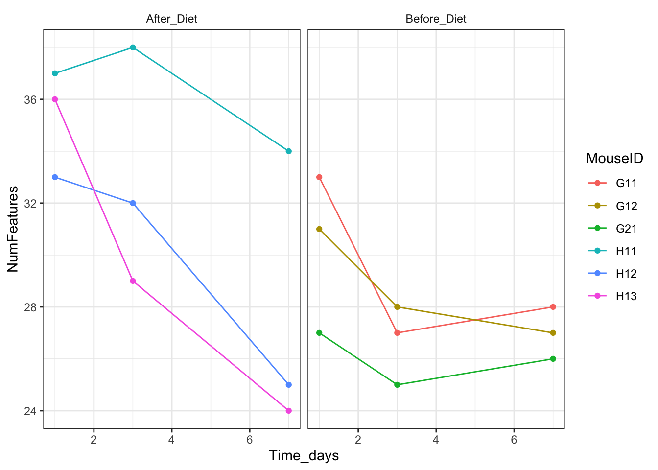
How about color scales? I use the ColorBrewer palettes, but again there are many options.
#install.packages("RColorBrewer")
RColorBrewer::display.brewer.all()
features_over_time + theme_bw() + theme(strip.background = element_blank()) + scale_color_brewer(palette = "Set1")
features_over_time + theme_bw() + theme(strip.background = element_blank()) + scale_color_brewer(palette = "Dark2")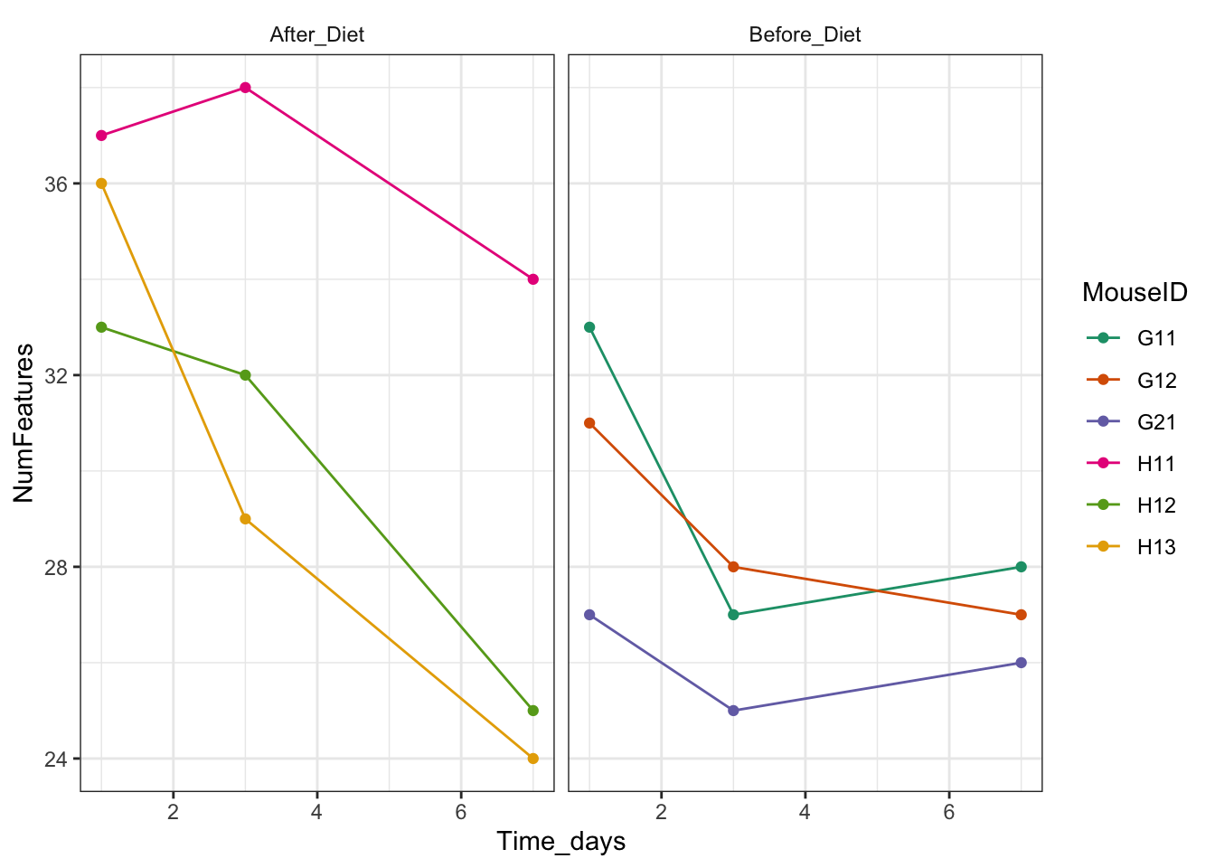
How can we change the order so that Before_Diet appears first?
features_over_time <- features %>% filter(Reads > 0) %>%
  group_by(MouseID, Treatment, Time_days) %>%
  summarize(NumFeatures = length(unique(FeatureID))) %>%
  ggplot(aes(x = Time_days, y = NumFeatures, color = MouseID)) + geom_point() + geom_line() + facet_wrap(~factor(Treatment, levels = c("Before_Diet", "After_Diet")))

features_over_time <- features_over_time + theme_bw()
There’s a lot more on these topics in the ggplot2 cheat sheet.
If you like the theme changes (lines, axes, backgrounds) you created better than the default theme, you can save them as an object to be able to easily apply them to other plots you may create:
# define custom theme
grey_theme <- theme(axis.text.x = element_text(colour = "grey20", size = 12, angle = 90, hjust = 0.5, vjust = 0.5),
                          axis.text.y = element_text(colour = "grey20", size = 12),
                          text = element_text(size = 16))

# create a boxplot with the new theme
features_over_time +
    grey_theme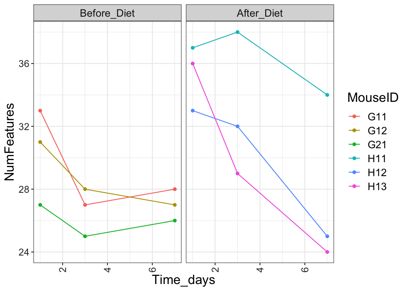
Arranging and exporting plots
Faceting is a great tool for splitting one plot into multiple plots, but sometimes you may want to produce a single figure that contains multiple plots using different variables or even different data frames. There are a couple different packages available to do this. I’ll show you how to do it with the package cowplot.
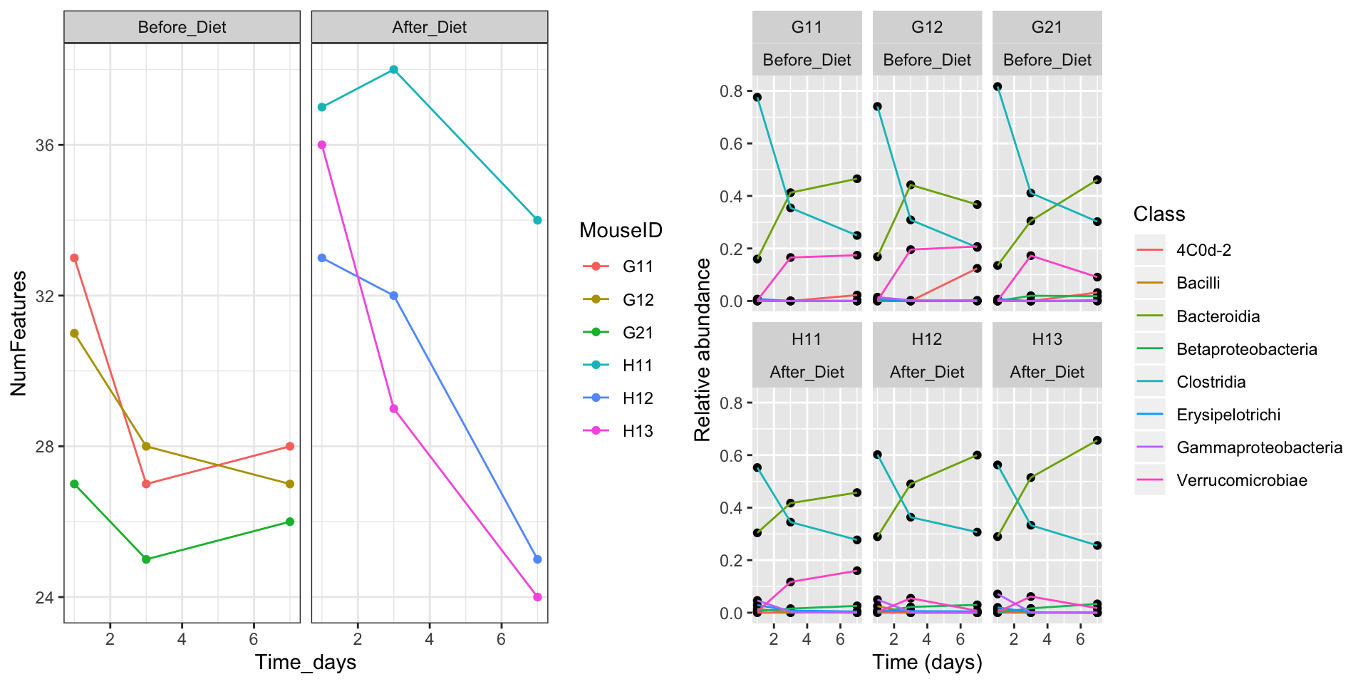
We can also specify the row and column layout:
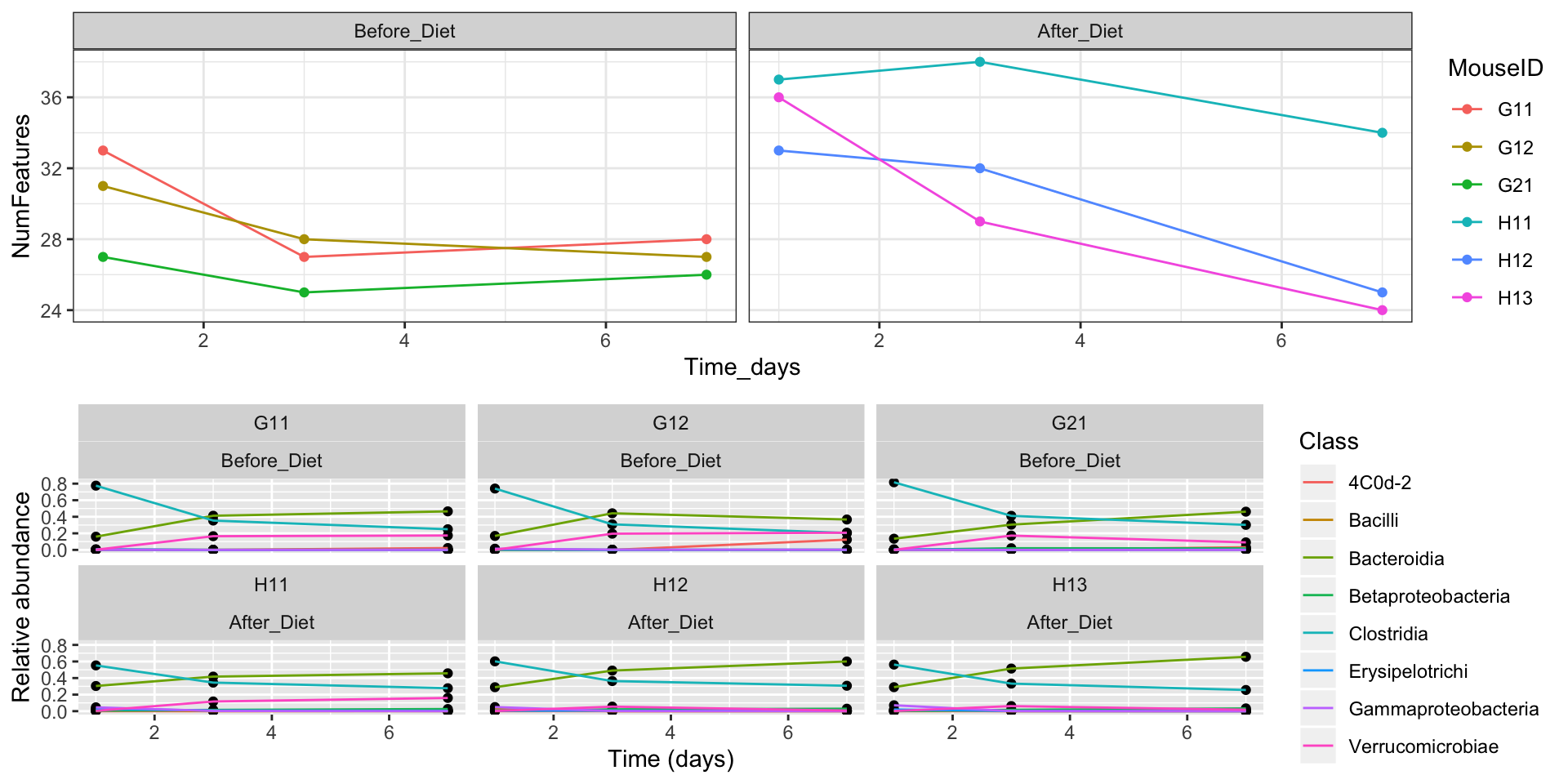
We can also adjust their relative sizes, align the plot grids, and put labels on them:
final_figure <- plot_grid(features_over_time, class_plot + theme_bw(), nrow = 2, rel_heights = c(2, 3), align = "v", axis = "lr", labels = c("a", "b"))
final_figure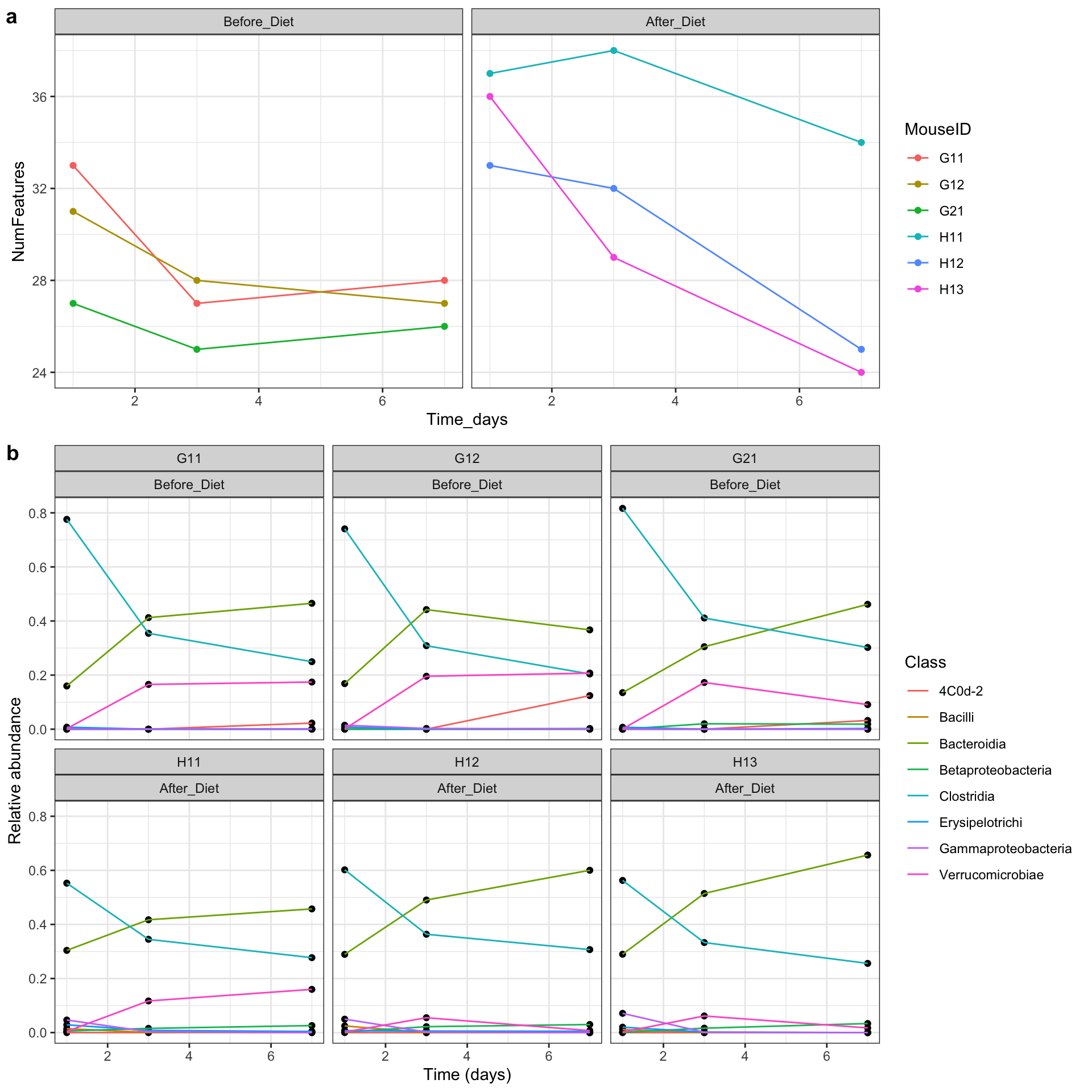
Another package for doing similar operations is called patchwork.
After creating your plot, you can save it to a file in your favorite format. The Export tab in the Plot pane in RStudio will save your plots at low resolution, which will not be accepted by many journals and will not scale well for posters.
Instead, use the ggsave() function, which allows you easily change the dimension and resolution of your plot by adjusting the appropriate arguments (width, height and dpi).
Make sure you have the fig/ folder in your working directory.
Note: The parameters width and height also determine the font size in the saved plot.
Page built on: 📆 2020-04-23 ‒ 🕢 11:53:04
Data Carpentry, 2014-2019.
Questions? Feedback?
Please file
an issue on GitHub.
On Twitter: @datacarpentry
If this lesson is useful to you, consider